 A Space for Thoughtful


Typesetting That Speaks Your Brand’s Language and Looks the Part
Summarize with:
If carried out properly, brand consistency will become your company’s most rewarding asset. This is because brand consistency has the power to increase revenue by 10-20%. However, 15% of organizations do not have typesetting standards and style guides.
Style guides for typesetting consistency will help you ensure that your messaging and marketing content align with your company’s standards, ideals, and identity, presenting a unified image and message to both current and potential customers.
It will also help you build trust and credibility with your audience, further boosting your brand image and laying down the foundations for higher revenues and returns on investment.
This article will help you maximize its benefits by helping you understand its role in brand consistency and providing practical steps to ensure compliance.
Table of Contents:
- What is Typesetting?
- The Significance of Legibility
- The Role of Aesthetics
- Tips for Interplaying Aesthetics and Legibility
- The Importance of Style Guides in Production
- Creating Effective Style Guides for Typesetters
- 5 Practical Steps for Enforcing Style Guide Compliance
- Top 6 Ways Typesetting Services Influence Your Brand Voice
- Choosing the Right Font Conveys the Essence of Your Brand Voice
- Ensuring Text Size is Visually Appealing for Easy Navigation
- Curating an Organized Page Layout that Makes Your Website Stand Out
- Asserting Proper Uniformity for Increased Consumer Attention
- Establishes Proper Color Contrast
- Makes Your Digital Content More Accessible
- Takeaway
What is Typesetting?
To define typesetting, it is the process of generating text using distinct types — the characters, symbols, and letters in digital systems — is known as typesetting. It’s an essential aspect of the design world that requires knowledge of typefaces, matching font sizes, and line spacing.
Good typography and typesetting are imperceptible, allowing readers to resonate with the font. Although typesetting in publishing is mainly concerned with print, it can also significantly impact digital media.
In the past, a specialized typesetter would often handle this manually. However, typesetting software has evolved into a game-changing tool that allows designers and artists to choose and modify fonts, spacing, and formatting seamlessly.
At a compound annual growth rate (CAGR) of 7.5%, the extent of the global typesetting software market is projected to increase from USD 1.02 billion in 2017 to USD 2.06 billion by 2030. The market for typesetting services software has expanded because of the growing need for digital material.
The Significance of Legibility
Legibility in typesetting is akin to clarity in speech. It’s the cornerstone of effective communication. It refers to the ease with which written or printed text can be read and comprehended.
Taking into consideration the legibility and readability of a design has several benefits:
- Legible text ensures that readers can effortlessly navigate through content.
- Illegible or poorly typeset text places an unnecessary cognitive burden on the reader. This extra effort required to decipher the content can lead to frustration and reduced engagement.
- It ensures that individuals with varying visual abilities can access and understand the content. Meeting accessibility standards is ethical and expands the message’s reach to a wider audience.
- Legibility is closely associated with trust and credibility in professional and academic contexts. Well-structured, legible documents convey a sense of authority and competence. On the other hand, illegible content may be perceived as unprofessional or unreliable.
- Legibility reflects attention to detail and commitment to quality for businesses and brands. Consistently legible branding materials, such as logos and marketing collateral, contribute to a positive brand reputation.
The Role of Aesthetics
Aesthetics is equally important in design, as the allure draws you to a particular artwork. It’s the visual appeal and creative flair that typography brings to a message.
While legibility ensures clarity, aesthetics elevate text from mere words to a captivating visual experience. Getting the aesthetics right can also benefit you in many ways. They are:
- Aesthetically pleasing typesetting grabs the viewer’s attention and holds it. Whether through elegant serifs, modern sans-serifs, or creative display fonts, aesthetics can evoke emotions, set the mood, and enhance the overall impact of a message.
- Aesthetics are integral to establishing and reinforcing brand identity. Font choices, color schemes, and typographic styles become synonymous with a brand, making it instantly recognizable.
- Aesthetically pleasing design, including typography, contributes to an improved user experience. It makes content more enjoyable, whether in print, on a website, or in an app.
Tips for Interplaying Aesthetics and Legibility
To help ensure the ideal readability of their documents or eBooks, publications often use professional typesetters who can transform a normal document into an appealing yet highly legible piece of text.
Wondering what a typesetter is or what typesetting companies can help with? Achieving the perfect balance between legibility and aesthetics is exactly what typesetting services are all about.
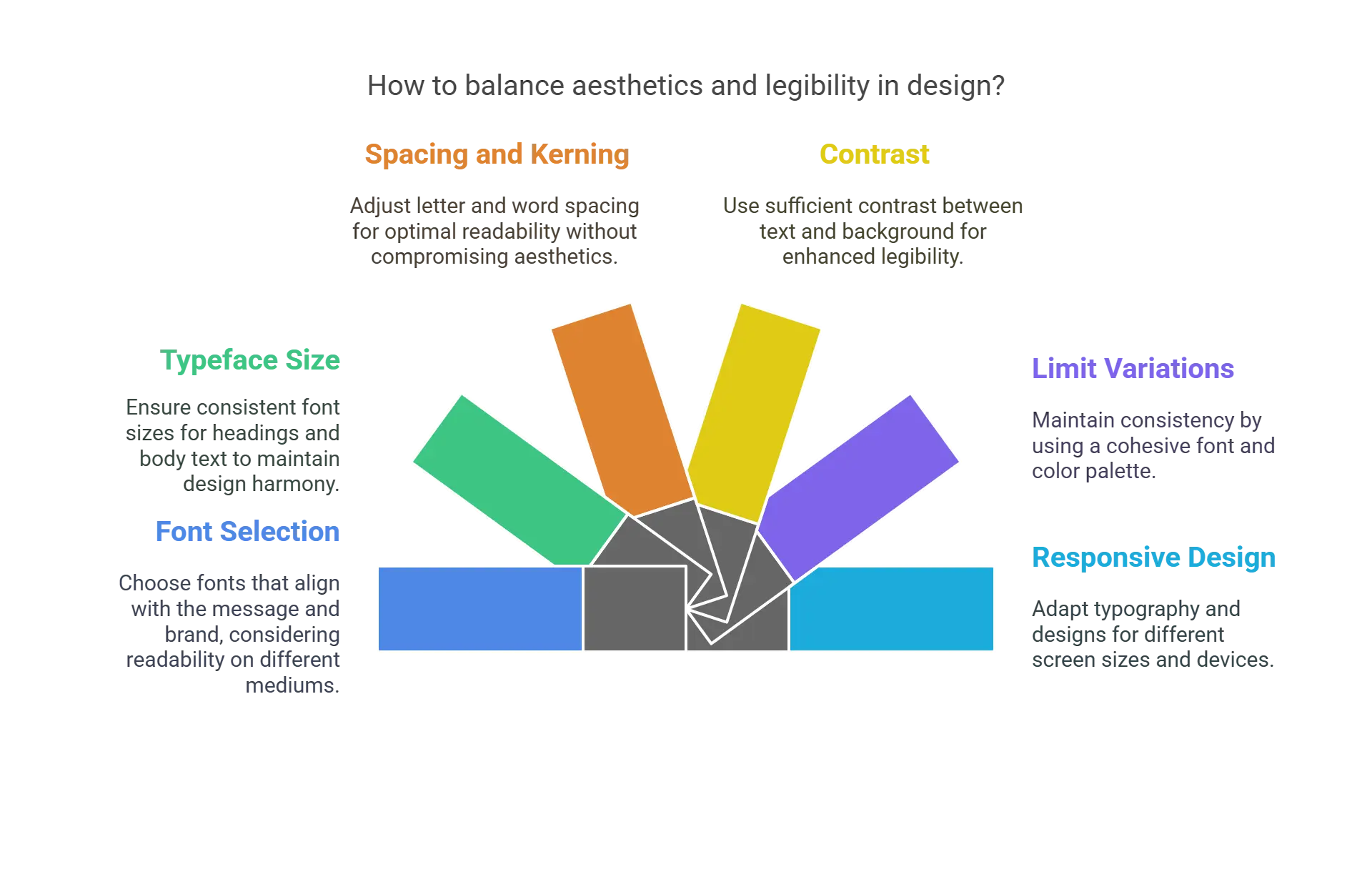
To help you strike that equilibrium, here are some practical tips and techniques:
1. Focus on Legibility First
Choose fonts that prioritize font legibility and align with the message and brand. Depending on the purpose and type of publication, you can select fonts that blend perfectly with the design.
For example, Sans-serif fonts like Arial or Helvetica are often more readable on screens, while serif fonts like Times New Roman work well in print.
Experiment with font pairing for added visual interest.
2. Typeface Size
Pay attention to font size, which also plays an important role in aesthetics. If the heading and the main text are mismatched, it will derail the entire design.
For body text, a general guideline is to use 10-12 points for print and 16-18 pixels for digital. Headings can be larger, but consistency should be maintained throughout the design.
3. Spacing and Kerning
Adjust letter and word spacing (kerning and tracking) to ensure characters are neither cramped nor loose. Proper spacing aids legibility without compromising aesthetics.
4. Focus on Contrasts
Ensure sufficient contrast between your design text and background colors. High contrast enhances legibility. For instance, dark text on a light background enhances readability and vice versa.
To get the perfect contrast, designers should test different color combinations for readability, especially for users with visual impairments.
Choosing the right typesetting and design can aid in accessibility, making it crucial to take your materials to include all users, even those with disabilities.
5. Limit Variations
Avoid using too many fonts or variations within a design. Stick to a cohesive font and color palette to maintain consistency and prevent visual clutter.
A good rule is to use no more than three fonts: one for headings, one for subheadings, and one for body text. The same applies to colors; ensure they follow the brand guidelines and there aren’t too many variations.
6. Follow the Principles of Responsive Design
In web design, consider how typography and designs adapt to different screen sizes and devices. This requires a basic understanding of design and needs testing on multiple devices.
Following basic responsive design principles, the same fonts, colors, or designs can make sense on multiple devices and platforms without being distorted or cropped, losing character.
These tips can seem challenging, but new technologies are helping make this much easier. AI-based typesetting software or LaTeX typesetting tools can automate and streamline this process.
So the next time you are unsure of selecting your formatting options or wonder who wins the LaTeX vs. Word debate, you can decide based on your specific needs.
While some formatting options are available in systems like Word or Google Docs, LaTeX offers an edge. Its customizable features make it ideal for designing an eBook, online magazine, or digital publication.
The Importance of Style Guides in Production
To achieve brand consistency, you must resort to typesetting standards and style guides. These include color palettes, imagery, logo use, typography, audio marks, language, and tone of voice. Thus, they are important tools for editorial managers that will help them represent the brand correctly and uniformly.
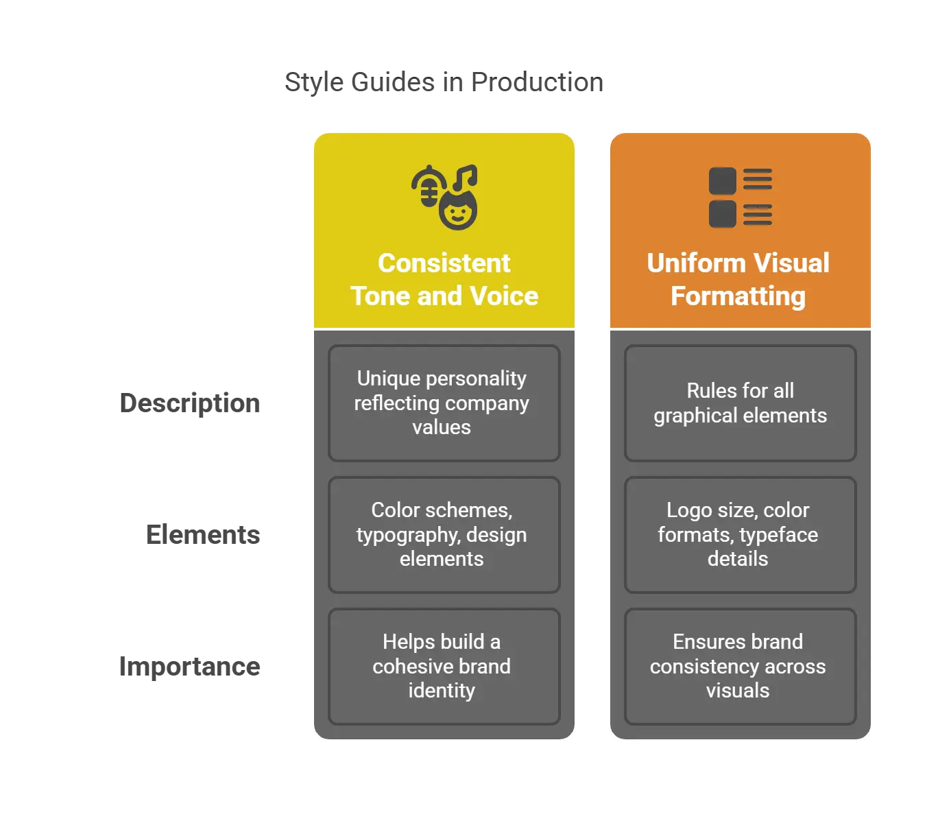
The importance of style guides in production is huge because they will help your business achieve the following:
1. Consistent Tone and Voice
A brand tone and voice is the personality that your brand showcases through all of its communications.
It is unique to each company and reflects its values, thus helping you stand out from your competitors and winning the trust of your customers and potential customers.
However, you must ensure that your brand voice follows a consistent tone and voice because it plays a significant role in how your brand is identified and recognized.
Thus, typesetting standards are important because they will help you build a cohesive brand identity. This is made possible with the help of consistent color schemes, typography, and design elements.
2. Uniform Visual Formatting
Your style guide also helps you achieve uniform visual formatting because it includes rules for all graphical elements. This includes the minimum size of the logo, the size of other assets like taglines, and the color formats of graphical elements.
It also mentions details like the amount of white space that needs to be kept around a design and which color variations should be used.
Additionally, the HTML color codes for each shade are specified, along with Pantone color matching names and numbers, print colors (CMYK), and digital colors with HEX and RGB codes.
The details of typefaces are also mentioned. For instance, what is the purpose of each typeface, which font alignment should be followed, and what should be the spacing between your fonts?
Lastly, it also helps ensure brand consistency by laying out guidelines about the kind of images that can and cannot be used. This is in terms of their resolution, legal rights, and the feeling that the image gives.
Creating Effective Style Guides for Typesetters
When creating effective style guides for typesetters to elevate your brand, you must ensure that they are easy to read, understand, apply, and access.
The steps for creating effective style guides for typesetters are:
Step 1: Define your brand identity by mentioning your company’s values, mission, character, voice, and market.
Step 2: Include the logo’s usage in your style guide and mention guidelines for making it memorable.
Step 3: Choose a color palette for your brand that accurately reflects its personality and values and connects with your audience. Also, mention any special considerations or restrictions that must be followed during color usage.
Step 4: Another key element that you must determine is typography, including font style, size, weights, and spacing. Also, specify the kind of stylizations that you want or do not want in your written materials, and the purpose of different font styles.
Step 5: Mention how you want your brand to be perceived in all your communications. You can set instructions for this in terms of language, vocabulary, and writing style. You will also need to explain whether you want a casual brand voice, an authoritative brand voice, or a formal brand voice.
Step 6: Specify parameters for illustrations, photography, and icons to set guidelines for the use of images. Also, discuss color treatments, composition, and the preferred overall aesthetic.
Step 7: To make your typesetting standards and style guides comprehensive, make sure that you provide all the required specifications for different mediums, such as print materials, digital platforms, social media, advertising, and packaging.
Lastly, an effective style guide evolves and grows with your brand, always aligning with its personality.
5 Practical Steps for Enforcing Style Guide Compliance
The five practical steps that you must take to enforce style guide compliance and unlock typesetting mastery are:

Step 1: Set Clear Rules and Guidelines
To keep your branding consistent, you must ensure that your typesetting standards and style guides are comprehensive, clear, and easy to follow. It should also be easily accessible to anyone who is working on the production.
Additionally, make sure that you explain the reasoning behind each of your guidelines and choices and how they will reflect your brand’s personality. This will also help your team members understand the influence of typesetting on your brand voice.
Step 2: Train and Educate Your Team
You must train and educate your team by conducting regular webinars, workshops, training sessions, and online courses.
This will also help them understand your company’s brand identity, values, and voice, which will help them ensure brand consistency in typesetting.
You should also encourage them to ask questions and share their ideas or suggestions for the style guide.
Step 3: Make Use of Checklists, Tools and Templates
By making use of tools and templates, the design and content creation processes would get simplified and automated while reducing the risk of errors, helping you save time, and ensuring brand consistency.
Also, enforcing compliance with style guides will become easier by making a checklist of the key elements.
You can also use software to create and store brand assets like logos, taglines, and colors so that all your team members can easily access them.
Step 4: Track and Measure Your Results
Using metrics like clicks, conversions, engagement, and feedback, you can understand how your publications are performing with the audience.
To better maintain brand consistency, you can even conduct interviews or surveys to find out how your audience perceives your brand.
The insights gathered will help you make the necessary changes so that they better align with your brand values.
Step 5: Encourage Communication
Establish open communication channels between your editors and team members so that they can discuss the typesetting standards and style guides and resolve their questions.
This will help them gain proper clarity on how to ensure brand consistency.
Top 6 Ways Typesetting Services Influence Your Brand Voice
Typesetting embodies the visual identity of the brand. As a result, it immediately influences consumer perception of a brand.
From social media posts to advertisements, employing the best typesetting processes to define a brand voice goes a long way in the following ways.
1. Choosing the Right Font Conveys the Essence of Your Brand Voice
Fonts communicate the persona and essence of your brand; they are more than just an aesthetic choice.
The main goal of typesetting services is to ensure that the font choice is suitable and perfect for your customers. Try using fonts that complement the tone and objective of your website.
Examine the logos of well-known worldwide corporations such as Google, Visa, Volkswagen, and Coca-Cola to see how important typefaces are in branding; none of these logos use graphics.
2. Ensuring Text Size is Visually Appealing for Easy Navigation
Crucial components of typesetting are readability and legibility, guaranteeing that your design or choice of fonts does not compromise the ease of consuming the content on your website.
Your text will be readable if it is typeset effectively. Selecting the appropriate font size and line spacing is necessary for this.
When a website is well-typeset, users easily navigate through the text. For example, using larger text sizes for headers and titles renders the content skimmable.
3. Curating an Organized Page Layout that Makes Your Website Stand Out
A website’s layout greatly influences how user-friendly, aesthetically pleasing, and simple to navigate it is.
When utilized effectively, a smart layout provides coherence between your landing pages, boosts user engagement, and aids users in comprehending the brand content on your website. Adobe typesetting is popularly used for designing attractive layouts. It ensures your layout is both machine-readable and database-indexable.
Typesetting Adobe equips you with different types of topography tools that allow you to alter page orientation, line spacing, and paragraph positioning for a clutter-free page layout that visually appeals to the customers.
4. Asserting Proper Uniformity for Increased Consumer Attention
A powerful brand voice is consistent, uniform, and resonates with its customers.
Typesetting services ensure consistency in text throughout your brand website. This is done by maintaining consistency in the style of fonts, color, accent, and layout.
In the case of companies dealing with science and technology, LaTeX typesetting is used to ensure uniformity in the content, inclusive of equations, symbols, and scientific data.
5. Establishes Proper Color Contrast
Color is an effective tool in InDesign that directly impacts user experience by creating a mood or conveying a brand message.
Designers sometimes underestimate the power of textual content compared to their designs. As a result, when formatting text, they could utilize overly vivid or subdued colors, which makes the text more difficult to distinguish and comprehend.
However, the underlying idea of typesetting in publishing makes sure that text color satisfies desktop or mobile WCAG AA standards and has a suitable balance of color contrasts, brightness, and whitespace.
On a webpage with a lighter or white backdrop, the text will be dark or black for ease of reading.
6. Makes Your Digital Content More Accessible
Typesetting services publish information and user interface components in a way that users can easily perceive. This is done by choosing and using fonts, maintaining adequate contrasts, and using widely accessible line spacing.
You can use multilingual typesetting to globalize or localize your brand. It aims to translate and present your brand voice in a manner that resonates with a specific culture or language, thus efficiently reaching out to your target audience.
Takeaway
It is common to overlook or forget about typography altogether when developing a brand identity. However, because the text is used so frequently in advertisements across several platforms, its uniformity is vital to building a powerful brand voice.
Typesetting services are an approach that can drastically improve your website’s accessibility and usability. It’s not only about how your website looks or is designed.
By being mindful of the intricacies of typesetting, you can design a visually appealing website that provides users with an amazing experience, increasing the value of your brand.
If you are looking for top-notch typesetting services to build your brand voice, visit Hurix Digital. Whether it’s simpler pagination levels or intricate design tasks, our typesetters have vast experience working on traditional typesetting.
We’ll work with you to create the ideal page layout so that your readers have the best possible experience.
Get in touch with us today!
Summarize with:

Vice President – Content Transformation at HurixDigital, based in Chennai. With nearly 20 years in digital content, he leads large-scale transformation and accessibility initiatives. A frequent presenter (e.g., London Book Fair 2025), Gokulnath drives AI-powered publishing solutions and inclusive content strategies for global clients