 A Space for Thoughtful


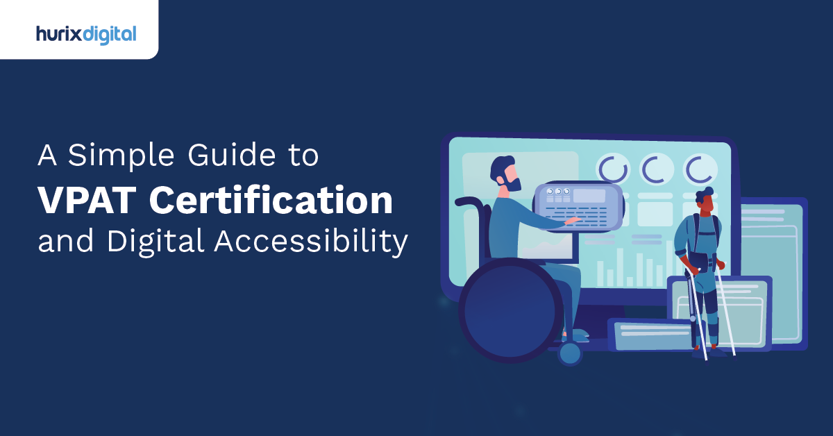
Is Your Website Excluding Millions of Users Without You Knowing It?
Summarize with:
Imagine walking into a library, excited to check out a new book, only to find the doors locked, the ramp missing, and the signs written in a language you don’t understand. Frustrating, right? Now, translate that experience to the digital world. That is the daily reality for millions of people when they encounter websites and apps that weren’t built with digital inclusion in mind.
We often talk about the internet as the great equalizer. But is it really equal if a significant portion of the population can’t use it effectively?
The creation of inclusive online spaces is more than just a “nice-to-have” feature in today’s digital-first world. Whether you are a developer, a business leader, or a content creator, understanding how to dismantle digital barriers is critical.
This guide explores the depths of digital inclusion. We will break down why it matters, how to implement it through accessible design, and the common pitfalls you need to avoid to ensure your digital doorstep is open to everyone.
Table of Contents:
- What is Digital Inclusion and Why Should You Care?
- Inclusive Website Development: A Step-by-Step Framework
- 5 Most Common Accessibility Errors (and How to Fix Them)
- Moving Beyond Compliance: A Culture of Empathy
- The Future of Digital Inclusion
- Conclusion
What is Digital Inclusion and Why Should You Care?
At its core, digital inclusion is about ensuring that all individuals and communities, including the most disadvantaged, have access to and use of Information and Communication Technologies (ICTs). But it goes beyond just having a Wi-Fi connection. It’s about the practical ability to use digital tools to navigate daily life.
When we build software or websites, we are building bridges. If those bridges have steps instead of ramps, we leave people behind.
The Business Case for Inclusion
You might be thinking, “This sounds great for social good, but what about my bottom line?”
Here is the reality: inclusive design is good business.
- Expanded Market Reach: Approximately 16% of the world’s population experiences significant disability. By ignoring accessibility, you are essentially ignoring a massive market segment.
- Better User Experience (UX) for Everyone: Features designed for accessibility often help everyone. Think about captions on videos. They are essential for the deaf community, but they are also incredibly useful for someone watching a video in a noisy train station or a quiet library.
- SEO Benefits: Search engines love accessible sites. SEO success depends on good heading structures, alt text for images, and clear navigation, pillars of accessibility.
Inclusive Website Development: A Step-by-Step Framework
Building a truly inclusive website doesn’t happen by accident. It requires intention, planning, and a commitment to standards like the Web Content Accessibility Guidelines (WCAG). Let’s look at a practical framework for embedding inclusion into your development lifecycle.
1. Start with the “Why” (Strategy Phase)
Before a single line of code is written, your team needs to be aligned. Digital inclusion must be a KPI, not an afterthought.
- Define Your Standards: Decide early on which level of compliance you are aiming for (usually WCAG 2.1 or 2.2 Level AA).
- Diverse Personas: When creating user personas, include people with diverse abilities. How would a user with a visual impairment navigate your checkout flow? How would someone with motor difficulties use your navigation menu?
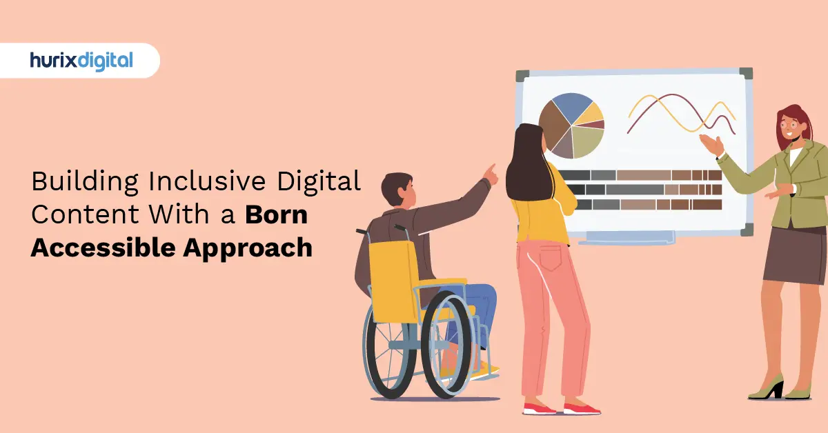
2. Design with Empathy (UX/UI Phase)
Design is where inclusion begins to take shape visually.
- Color Contrast is Key: Low contrast text is a nightmare for users with low vision (and honestly, for anyone looking at a screen in bright sunlight). Ensure your text pops against its background. Check color contrast with our free tool.
- Typography Matters: Avoid overly decorative fonts. Stick to clean, sans-serif fonts that remain legible at different sizes.
- Don’t Rely Solely on Color: Never use color as the only way to convey information. If an error message is just red text, a colorblind user might miss it. Use icons or text labels like “Error:” to clarify.
3. Code for Compatibility (Development Phase)
This is where the rubber meets the road. Your code needs to be robust and semantic.
- Semantic HTML: Use proper HTML tags(<header>,<nav>,<main>,<footer>, <button></button><button>). Screen readers rely on these tags to understand the structure of your page. A</button> <div>acting like a button is invisible to assistive technology unless you do a lot of extra work. Just use a <button>.</button></div>
</footer> - Keyboard Navigability: Throw away your mouse for a few minutes. Can you navigate your entire site using just the Tab key? If you get stuck in a “keyboard trap” or can’t access a menu, your site fails the inclusion test.
- ARIA Labels: Accessible Rich Internet Applications (ARIA) attributes help bridge gaps where HTML falls short. However, the first rule of ARIA is: don’t use ARIA if a native HTML element will do the job.
4. Content is King (Content Creation Phase)
Even the most perfectly coded site can fail if the content isn’t accessible.
- Alt Text: Every meaningful image needs alternative text (alt text). This describes the image to users who cannot see it.
- Clear Language: Avoid jargon. Use simple, direct language. This helps users with cognitive disabilities and non-native language speakers.
- Captions and Transcripts: If you use video or audio, provide captions and transcripts. This is non-negotiable for digital inclusion.
5 Most Common Accessibility Errors (and How to Fix Them)
Even with good intentions, developers make mistakes. We have audited countless digital products, and these five errors crop up constantly. Fixing them will significantly boost your site’s accessibility score.
Error 1: Missing or Poor Alt Text
We mentioned this above, but it bears repeating because it is so common.
- The Problem: Images are uploaded with filenames like IMG_5543.jpg as the alt text, or worse, no alt text at all.
- The Fix: Describe the function or content of the image. If it’s a decorative background swoosh, leave the alt text empty (alt=””) so screen readers skip it. If it’s a chart showing sales growth, describe the trend.
Error 2: Empty Links
- The Problem: You have a button that is just an icon, like a magnifying glass for search. In the code, it looks like . A screen reader might just read this as “Link.”
- The Fix: Add an aria-label or visually hidden text to give the link context. For example: ….
Error 3: Poor Color Contrast
- The Problem: Light gray text on a white background looks “sleek” to some designers but is unreadable to many.
- The Fix: Use tools like Hurix Digital Contrast Checker during the design phase. Aim for a ratio of at least 4.5:1 for normal text.
Error 4: Missing Form Labels
- The Problem: A form field has a placeholder inside it (e.g., “Enter email”) but no visible label outside it. When the user starts typing, the placeholder disappears, and they might forget what the field is for. Screen readers also struggle with this.
- The Fix: Always use a
Error 5: Outline Removal (The “Focus Ring”)
- The Problem: Designers often hate the default blue outline that appears around buttons when you click or tab to them. So, developers add outline: none; to the CSS.
- The Fix: Never remove the focus outline without replacing it. Keyboard users rely on this outline to know where they are on the page. If you remove the default, replace it with a custom style that fits your brand but remains highly visible.
Moving Beyond Compliance: A Culture of Empathy
Compliance is a checklist; inclusion is a mindset.
Achieving true digital inclusion requires a cultural shift within your organization. It means moving away from “How do we pass this audit?” to “How do we ensure everyone can use what we’ve built?”
Training and Awareness
Your team doesn’t know what they don’t know. Invest in training. Let your developers hear a screen reader in action. Let your designers try to navigate a site using a screen simulation tool that mimics color blindness.
When we build with empathy, we build better products.
Continuous Testing
Accessibility isn’t a “one-and-done” task. It’s a garden that needs tending.
- Automated Testing: Use tools like Axe or Lighthouse to catch low-hanging fruit (about 30-40% of errors).
- Manual Testing: Have humans test your critical flows.
- User Testing with People with Disabilities: There is no substitute for getting your product in the hands of people who actually use assistive technology. Their feedback is gold.
The Future of Digital Inclusion
As we look toward 2026 and beyond, the definition of digital inclusion is expanding. It’s no longer just about screen readers and color contrast.
We are seeing the rise of AI-driven interfaces, voice-first devices, and immersive realities (AR/VR). Each of these technologies brings new barriers and new opportunities.
- AI and Bias: We must ensure the AI models powering our digital interactions are trained on diverse datasets so they don’t perpetuate bias against marginalized groups.
- Neurodiversity: The conversation is expanding to include neurodiverse users—people with ADHD, autism, dyslexia, and other cognitive variations. Features like “dark mode,” “focus mode,” and customizable text settings are becoming standard expectations, not edge cases.
Conclusion
Digital inclusion is a journey, not a destination. It is complex, nuanced, and constantly evolving. But it is also one of the most rewarding challenges we face in the tech industry.
By prioritizing accessibility, we aren’t just ticking boxes or avoiding lawsuits. We are opening our digital doors to the world. We are saying, “You are welcome here.” And in a connected world, that is the most powerful message you can send.
Start small. Fix those alt tags. Check your color contrast. Try navigating your site with a keyboard today. Every small step is a victory for inclusivity.
Let’s build a web that works for everyone.
Ready to evaluate your platform’s accessibility? Contact our team at Hurix Digital to learn how we can help you build inclusive, compliant, and user-friendly digital solutions.
Summarize with:

Vice President – Content Transformation at HurixDigital, based in Chennai. With nearly 20 years in digital content, he leads large-scale transformation and accessibility initiatives. A frequent presenter (e.g., London Book Fair 2025), Gokulnath drives AI-powered publishing solutions and inclusive content strategies for global clients