 A Space for Thoughtful

Why Accessibility Scores Alone Can’t Guarantee Inclusivity: A Comprehensive Guide
Summarize with:
Table of Contents:
- What Is an Accessibility Score and Why Does It Matter?
- How Accurate Are Automated Accessibility Tools?
- Which Accessibility Metrics Matter for Your Business?
- Can a Perfect Accessibility Score Guarantee True User Inclusivity?
- How Do I Integrate Accessibility Scoring Into the Development Lifecycle?
- What Are the Limitations of Relying Solely on Accessibility Scores?
- How Does Accessibility Scoring Impact SEO and Brand Reputation?
- What Strategies Improve Accessibility Scores for Diverse User Needs?
- How to Interpret Accessibility Score Reports Effectively and Avoid Pitfalls?
- What Innovative Approaches Enhance Accessibility Beyond Basic Compliance?
- A Final Word
What Is an Accessibility Score and Why Does It Matter?
An accessibility score is a form of report card of your website’s inclusiveness. It is a number and occasionally a percentage that attempts to quantify the level to which your site complies with accessibility regulations, such as the Web Content Accessibility Guidelines (WCAG). Think of it as a quick check-up: Are your images tagged with alt text? Is your color contrast strong enough? Can someone navigate your site using just a keyboard? Why does this matter? The web isn’t just for the fully fit or tech-savvy. It’s also for moms with low vision trying to buy groceries online or veterans with motor impairments applying for jobs. Accessibility scores help flag issues that could lock these folks out. But here’s the catch: a score isn’t a guarantee. It’s a snapshot, often from an automated tool, and those tools don’t catch everything. They can’t tell if your alt text actually makes sense or if your navigation feels intuitive to someone using a screen reader. Scores are not gospel. Apply them to identify red flags, but don’t leave it at that; get to know actual users, test with assistive technology, and consider empathy at the forefront.How Accurate Are Automated Accessibility Tools?
Existing automated accessibility checkers are rather like that keen intern who can identify the typos but misses the big picture. Leave in a URL, and they will have a list of things to scold you about, missing alt text, wacky ARIAs, and low contrast. Very useful, isn’t it? Nevertheless, do not deceive yourself into thinking that it is the complete truth. We once audited a site that aced every automated test. Green checkmarks everywhere. But when a user with a screen reader tried it, they couldn’t find the main menu. The tool didn’t catch that the menu’s structure was a mess for assistive tech. Automated tools are great for catching low-hanging fruit, but they’re blind to real-world context. They’ll tell you an image has alt text but won’t say if it’s just “image123.jpg” instead of something useful like “red apple on a wooden table.” These tools also struggle with nuanced interactions. Can a keyboard user tab through your forms smoothly? Does your site overwhelm someone with cognitive disabilities? No tool can answer that fully. The fix? Pair automated checks with manual testing. Get real people with disabilities to try your site. Their feedback is gold—way more valuable than any algorithm’s output. Tools point you in the right direction, but humans show you the destination.Which Accessibility Metrics Matter for Your Business?
Not all metrics are created equal, and what matters depends on who you’re serving. If you’re running an e-commerce site, task completion rates are huge. What are the chances that a person with a motor disability can add an item to their cart and then check out without quitting in rage? We once worked with a retailer whose dropdown menus were a nightmare for keyboard users. Sales were tanking, and they didn’t even realize why until we tested with real users with flesh and blood. Error rates are another biggie. If a screen reader user hits constant roadblocks—like unlabeled buttons—that’s a sign your site’s failing them. Then there’s customer satisfaction. Are people with disabilities not just using your site but actually enjoying it? A quick survey or a peek at social media can reveal more than any number. A client got glowing reviews after we simplified their navigation for cognitive accessibility. It wasn’t just about function; it felt respectful. Meeting WCAG is not the objective, but a minimum. It is like a building inspection, not condemned, and that does not imply that it is comfy. Concentrate on the metrics that you can relate to the needs of your audience. In the case of targeting older users, however, it pays to focus on readable fonts and high contrast. When it applies to the international audience, consider the ease of the language used by non-native speakers. Numbers are good entry points, but the true metric is whether your users feel heard.Can a Perfect Accessibility Score Guarantee True User Inclusivity?
A perfect accessibility score feels like a gold star, doesn’t it? But here’s the truth: it’s not a guarantee everyone can use your site. We learned this the hard way on a project where we hit 100 on a WCAG audit. Launched the site, popped the champagne, then got an email from a user with dyslexia saying the text-heavy pages were hard to navigate. We’d checked the boxes but missed the human experience. Scores focus on technical stuff: alt text, keyboard navigation, contrast ratios. Vital? Yes, but inclusivity is messier. It’s about how a site feels to someone with autism, or how intuitive it is for a screen reader user juggling multiple disabilities. A tool might say your captions are perfect, but if they miss the tone of a video’s music, they’re not truly accessible. True inclusivity means going beyond the checklist. It’s testing with real people, not just algorithms. It’s asking, “Does this work for someone who’s distracted, tired, or using old tech?” It’s embracing the chaos of human needs. A perfect score is a foundation, but building a truly inclusive site takes heart, iteration, and a willingness to listen.How Do I Integrate Accessibility Scoring Into the Development Lifecycle?
Integrating accessibility scoring into your development process isn’t just about compliance—it’s about making inclusivity second nature. Start early, in the design phase. Create personas that include people with disabilities. For example, on this project, we designed for a screen reader user from the get-go. This forced us to prioritize semantic HTML, and the whole site ended up cleaner. During coding, use static analysis tools to catch issues like missing alt text or bad contrast. They’re like smoke detectors—loud and annoying but lifesaving. But don’t stop there. Manual testing is where the magic happens. I remember a developer cursing when a user with limited dexterity pointed out our buttons were too small. A quick tweak made a world of difference. Make accessibility part of your regression testing. Every new feature, every update—run those checks. It’s not glamorous, but it prevents backsliding. We have seen teams launch shiny new features only to break keyboard navigation. Painful lesson. Treat accessibility like code quality: a constant, not a one-off. It’s not perfect, but it’s progress.What Are the Limitations of Relying Solely on Accessibility Scores?
Accessibility scores are seductive. A clean 90 feels like victory. But leaning on them alone is like judging a book by its cover. We once saw a site score 92, yet a blind user couldn’t complete a purchase because the “Buy Now” button wasn’t labeled properly. The tool didn’t care; the user did. Automated tools check for technical compliance—think missing tags or contrast issues. But they can’t judge if your alt text is useful or if your navigation confuses someone with ADHD. They’re like a calculator: great for crunching numbers, useless for understanding emotions. Over-relying on scores risks a compliance-first mindset, where you’re ticking boxes instead of building for humans. Real accessibility comes from user testing. Invite people with disabilities to try your site. Their struggles reveal what no tool can. We once watched a tester with low vision squint at a “compliant” color scheme—it passed the test but failed in sunlight. Scores are a starting line, not the finish. Keep them in perspective, and prioritize real-world feedback.How Does Accessibility Scoring Impact SEO and Brand Reputation?
Here’s a not-so-secret secret: accessibility boosts your SEO and brand. Google loves sites that users love. If your site’s a pain for screen reader users, they’ll bounce, and Google notices. We worked on a charity site years ago—ancient, inaccessible, and buried in search results. We added alt text, fixed navigation, and improved contrast. Donations rose, and so did their rankings. Correlation? Probably not just a coincidence. Accessible sites keep users engaged longer, lowering bounce rates and signaling quality to search engines. But it’s not just about algorithms. Accessibility screams, “We care about everyone.” Ignore it, and you risk a PR nightmare. Social media doesn’t hold back when brands exclude people. We have seen so many companies called out for inaccessible forms—it’s not pretty. Investing in accessibility isn’t just right; it’s smart business. It builds trust and widens your audience.What Strategies Improve Accessibility Scores for Diverse User Needs?
Chasing a high accessibility score is fine, but real inclusivity means designing for actual humans. Forget the “average” user—think specific. Picture a dad with arthritis using voice navigation or a student with dyslexia on a noisy train. What do they need?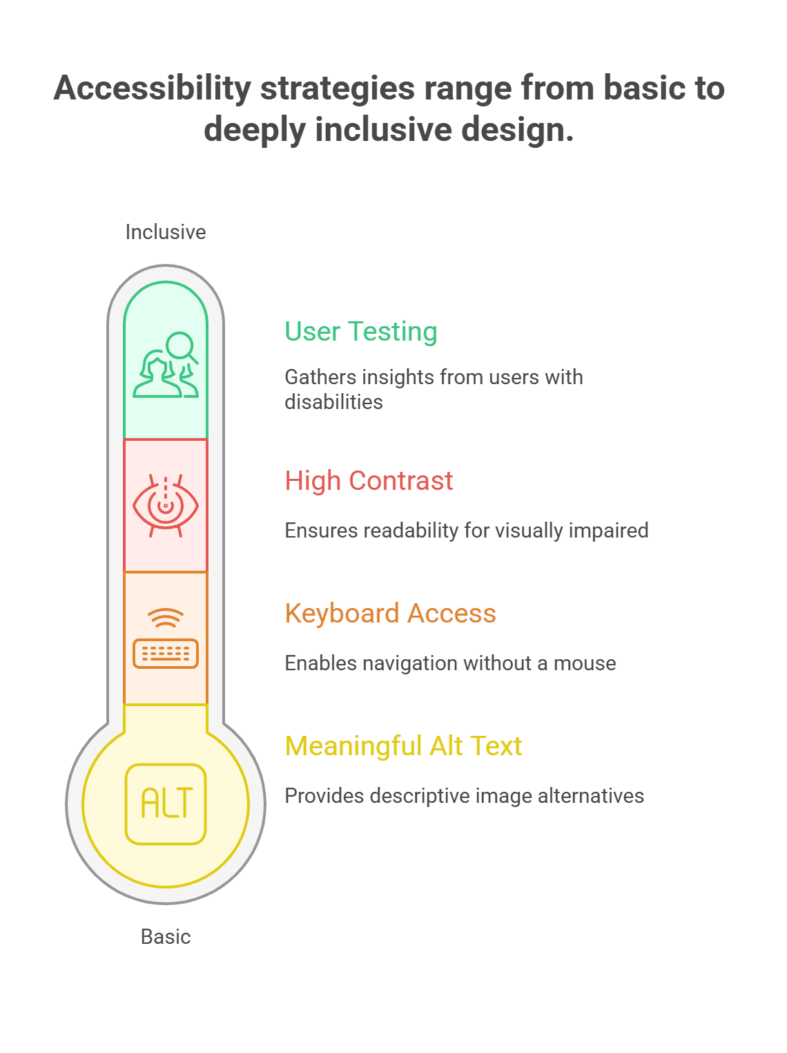
Beyond the Basics: Meaningful Alt Text and Keyboard Access
Alt text is a must, but make it count. “Photo of a Sun” is lazy; “Vibrant orange sunset over a calm lake” helps a screen reader user see it. Keyboard navigation is another biggie. Can every button, link, and form be reached without a mouse? I once fixed a site where the “submit” button was mouse-only. It was a total game-changer when we added keyboard support.Ensure Readability with High Contrast and User Testing
Contrast matters too. We have squinted at sites with “stylish” gray-on-gray text—unreadable. Use contrast checkers, but also test in real conditions, like bright sunlight. And don’t skip user testing. Invite people with disabilities to try your site. Their insights will humble you. We once had a tester point out that our “clear” font was torture for dyslexic users. We switched, and the feedback flipped. Accessibility is not a set-and-forget. The web changes, and you will need to adapt your approach to it. Be inquisitive, constantly experiment, and prioritize people. It is not perfection, but it is progress.How to Interpret Accessibility Score Reports Effectively and Avoid Pitfalls?
Accessibility score reports can feel like a treasure map or a trap, depending on how you read them. A site we worked on once scored a 98, but users still struggled. The report missed that our images had alt text like “img_001.” Useless. Don’t obsess over the headline score. Dig into the details. Are the flagged issues real problems or nitpicky false positives? Some tools flag decorative elements as errors—annoying but harmless. Focus on impact. A missing form label is a dealbreaker; a quirky ARIA tag might not be. Cross-check with manual testing. Use a screen reader yourself—it’s eye-opening. Better yet, bring in users with disabilities. They’ll spot things no tool can, like a navigation flow that feels like a maze. We once learned from a tester that our “accessible” dropdown was a nightmare for motor-impaired users. Prioritize fixes that make the biggest difference, and treat reports as a guide, not a rulebook. Accessibility is a living process, not a one-time score.What Innovative Approaches Enhance Accessibility Beyond Basic Compliance?
Meeting WCAG standards is like passing a driving test—you’re legal, but are you a good driver? True accessibility goes deeper. It’s about crafting experiences that feel human, not just compliant. Take alt text. “Image of a chair” checks the box, but “Cozy wooden chair in a sunny cafe” brings the scene to life for a screen reader user. We once rewrote alt text for a client’s product photos, and their blind customers sent thank-you emails. Small effort, big impact. Captions are another area. Auto-generated ones are better than nothing, but they often garble slang or miss emotional cues. I watched a video where auto-captions turned “heartfelt speech” into “hard-felt peach.” Embarrassing. Human-edited captions show respect and make content sing. Cognitive accessibility is trickier but vital. Break up text walls with headings. Use simple language without dumbing down. We once simplified a legal site’s jargon, and users with cognitive disabilities said it was the first time they understood their rights. Listening brings innovation. Indeed, test with different users. Repeat it using their feedback as opposed to instructions. In the past, we have had our fair share of mishaps, such as thinking that a design was clear and then realizing that it wasn’t for autistic people.A Final Word
True accessibility is a lot more than aiming for a certain accessibility score. With the wide spectrum of experience exhibited by Hurix Digital, automated tools can only offer valuable information, but not everything, particularly when it comes to users who depend on assistive tools. The answer is harnessing these tools with manual testing and personal remarks given by a variety of diverse users to build up the digital surroundings, which are literally accessible and easy to operate. This way, accessibility is not just a compliance box but a significant addition to user experience and involvement. Hurix Digital is uniquely positioned to guide organizations through this complex journey. Our comprehensive accessibility training, expert remediation services, and rigorous testing protocols help businesses meet regulatory standards and foster empathy-driven design. By partnering with us, decision makers can confidently transform their digital content into accessible experiences that resonate with all users, including those with disabilities. If you’re ready to elevate your digital accessibility and ensure your content is usable by all, connect with Hurix Digital today.Summarize with:

Vice President – Content Transformation at HurixDigital, based in Chennai. With nearly 20 years in digital content, he leads large-scale transformation and accessibility initiatives. A frequent presenter (e.g., London Book Fair 2025), Gokulnath drives AI-powered publishing solutions and inclusive content strategies for global clients