 A Space for Thoughtful


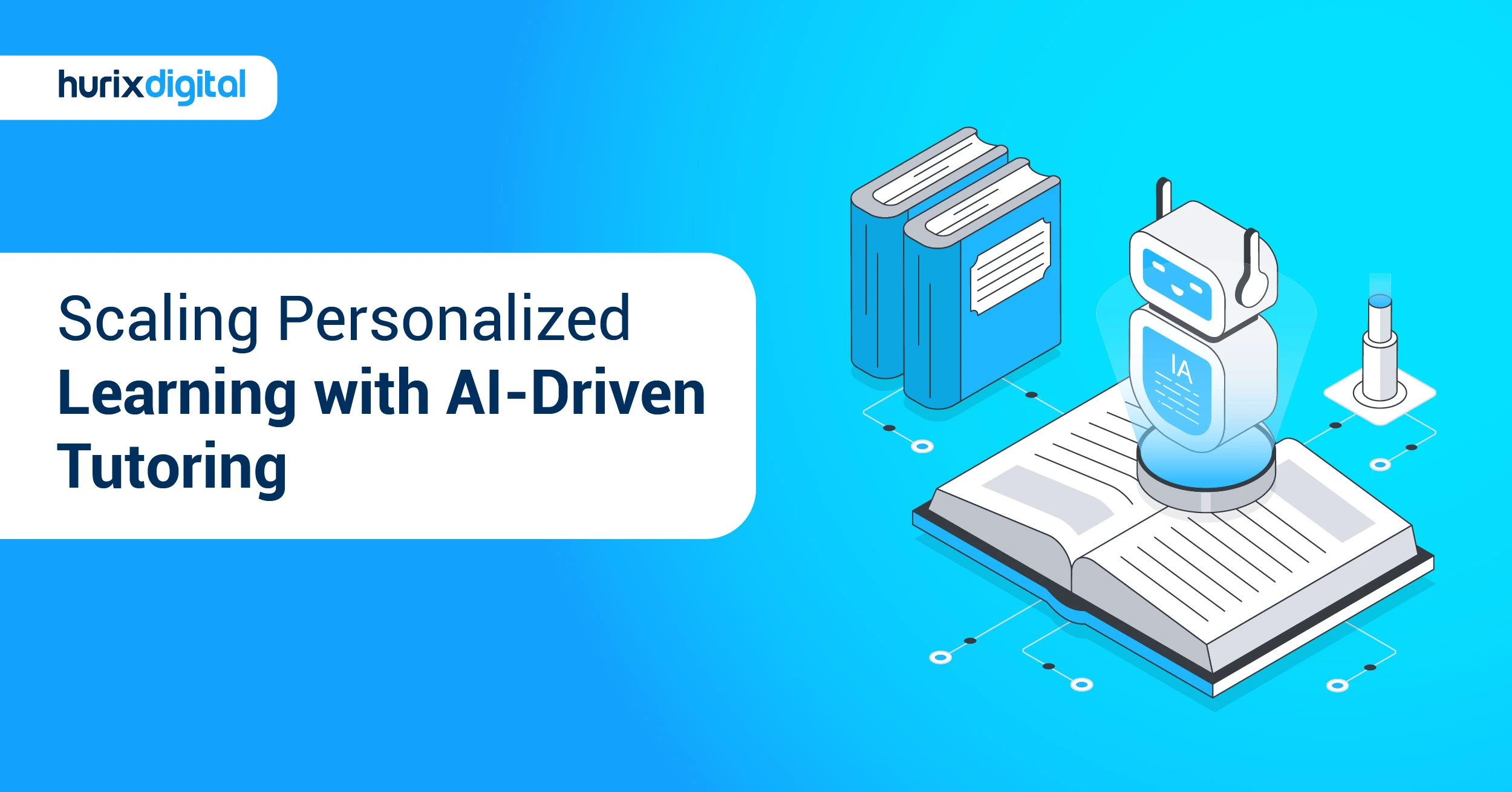
The Complete Guide to Responsive Mobile Learning Content for Modern Organizations
Summarize with:
Responsive eLearning refers to the design and development of online educational content that adapts and adjusts to different devices and screen sizes. The goal is to provide a seamless and optimal learning experience across a wide range of digital learning platforms, such as desktop computers, laptops, tablets, and smartphones. This approach is guided by two principles: fluidity and flexibility. Adopting responsive design in your mobile learning content can help address the challenges of delivering eLearning across various devices and platforms.
Working patterns have changed profoundly. While most employees embrace remote and hybrid models, a whopping 98% of employees want to work from home at least sometime in 2025. This means that the modern workforce is getting more mobile, as people access information and accomplish tasks using their smartphones and tablets. This shift calls for new thinking about training methods and paves the way for mobile learning solutions to keep pace with this dynamic world of work.
In this comprehensive guide, we’ll explore everything you need to know about creating effective mobile learning content, the critical role of responsive design, and best practices for upskilling your workforce.
Table of Contents:
- The Rise of the Mobile Workforce and Modern Learning Trends
- Why is Responsive Design Crucial for Mobile Learning Content?
- How Does Responsive Design Work for eLearning?
- How to Create and Repurpose Content for Mobile Learning
- How Responsive Design is Revolutionizing the Future
- Mobile Learning Best Practices for Workforce Upskilling
- A Final Word
The Rise of the Mobile Workforce and Modern Learning Trends
The modern workplace has transformed dramatically, largely thanks to the increased use of smartphones and tablets. Today, 66% of employees perform work-related tasks on their mobile devices, from checking emails and joining virtual meetings to accessing company data. This development has deep, critical implications for how organizations design employee training programs. Mobile devices have become an indispensable tool for today’s workforce.
As more people work remotely, the availability of training materials anytime, anywhere is necessary. Mobile devices allow them to learn on the go—from home, a coffee shop, or even a client’s office. This flexibility is fundamental for employees in fields like sales, healthcare, and construction. Mobile-friendly eLearning can lead to greater efficiency and productivity.
This shift has given rise to several key learning trends:
1. On-the-Go Learning
The rise of remote work has made on-the-go learning a necessity. Employees no longer want to be confined to traditional classroom settings or fixed schedules. They expect to access training materials anytime, anywhere. This trend has led to the development of mobile-friendly learning platforms and microlearning modules that can be easily accessed on smartphones and tablets.
2. Adaptive Learning Technologies
Adaptive learning technologies are also being developed to serve the preferences and needs of individual learners. The learning process is driven by algorithmic analytics of learner data, such as performance, engagement, and learning style. This personalized approach helps learners move at their own pace, concentrate on areas where they need more support, and stay motivated.
3. Microlearning
Microlearning involves breaking learning content into small, digestible pieces. This method is handy for people with busy schedules. It’s a powerful way to divide lessons into bite-sized chunks that learners can consume and assimilate at one go. 94% of learning and development professionals report that learners prefer microlearning formats over traditional training methods.
Why is Responsive Design Crucial for Mobile Learning Content?
In a digital world where devices are available in all shapes and sizes, it’s extremely important to ensure users get the best experience. People are constantly engaged on smartphones and tablets—browsing, shopping, and learning. They also switch between devices multiple times a day.
Responsive design provides a smooth transition for users from one screen size to another. This allows learners to efficiently complete their courses regardless of the device. Furthermore, responsive design helps you reach a broader audience by giving them the freedom to choose whichever device they prefer for their learning needs.
How Does Responsive Design Work for eLearning?
Several authoring tools built on HTML and CSS are available to develop responsive eLearning. This approach requires less development time and is cost-effective. In this method, responsive content automatically detects the screen size and optimally fits into the maximum available space. Consequently, there is no need to create different versions of the same course to function on different devices.
By making a single version of the responsive course, we can achieve hassle-free distribution and ensure it works wonders on multiple devices without compromising the user experience. To work effectively, responsive design in eLearning can be achieved by considering the following:
1. Designing Flexible Layouts
When using a wider screen device, users can scroll to see more content and images horizontally. However, on smartphones and smaller-screen devices, the content should be stacked and rearranged vertically. A well-thought-out design strategy will increase the effectiveness of your mobile learning. You can create templates to reuse in all your mobile learning courses. All you have to do is change the content and multimedia elements in these pre-designed layouts.
2. Choosing Appropriate Fonts
To ensure readability across devices, font type and size are very important. The font size may not look the same and can become pixelated on screens of different dimensions. Using the proper font type and size in responsive design will ensure optimal readability so users don’t need to squint their eyes.
3. Optimizing Images and Graphics
Images such as PNGs and JPGs need to be scaled and resized to fit different screen sizes. This could mean rearranging the images on the screen to give an optimal user experience. Choose images wisely so they reinforce the text, create a focal point of interest, and facilitate genuine interest in the subject. An appealing visual design helps learners stay focused and attentive.
4. Adapting Interaction and Navigation
Desktops and laptops include physical instruments like a mouse and keyboard for interaction, whereas smartphones and tablets are touch-based. This becomes an important aspect to consider when designing for interactive elements such as buttons and hyperlinks. Navigation must be intuitive for touch screens.
How to Create and Repurpose Content for Mobile Learning
Once you decide to make mobile learning an integral part of your strategy, the next step is to decide on the content. The material you currently have for an eLearning course may not be directly convertible. However, it can be repurposed to seamlessly integrate with your mobile learning strategy.
1. Organize Your Content
Go through your existing content and find patterns and similarities. This will help you break down the content into categories. Continue this process until large chunks of information become classified into topics and lessons. Next, break down lengthy text in each lesson into bullet points and highlight the key points, either in bold or a different color. Introduce each concept as succinctly as possible, perhaps with a single sentence or phrase, followed by bullet points, diagrams, or infographics.
2. Keep it Short and Focused
Keep in mind that your learners will access the mobile learning course in short bursts. They won’t have time to sit through a lengthy 30-minute module. Learners will access the course whenever and wherever they can. Also, virtual learners are often distracted, and this is even more relevant for mobile users dealing with myriad distractions. This is why it is crucial to keep your mobile learning content crisp, information-packed, and engaging. You must attract attention immediately and then hold it by providing crucial bits of knowledge. In mobile learning, the lesser the cognitive load, the better.
3. Format for Easy Readability
Your learners have a small window to access the course and will often be rushed for time. You need to get as much information as quickly as possible. This is where formatting becomes critical. Use headings, subheadings, and short paragraphs to make the content scannable. White space is your friend. It prevents the screen from looking cluttered and overwhelming.
4. Use Various Multimedia Formats
Mobile learning is effective only if the content is engaging and immersive. A major benefit is that the content can be packaged in a way that learners learn without even realizing it. Gamification and microlearning are just two examples of how mobile learning can be an enriching experience.
- Audio and Video: Video is one of the most popular formats for mobile learning. You don’t have to invest in expensive production; several free software options are available online. You can use in-house talent for voice-overs and free editing tools. Videos, if made properly, usually guarantee audience engagement and are effective for long-term retention.
- Interactive Elements: Add interactive elements like quizzes, polls, and simple games to pull learners in and hold their attention. This moves them from passive observers to active participants.
How Responsive Design is Revolutionizing the Future
Responsive design is shaping the future of eLearning and mLearning in several significant ways:
- Multi-device Accessibility: It allows learners to access educational content seamlessly across different devices. This flexibility accommodates learners’ preferences and lifestyles, ensuring they can engage with the material anytime, anywhere.
- Improved User Experience: Responsive design focuses on creating an optimal user experience by adapting the content layout and navigation. This approach eliminates the need for excessive scrolling or zooming, resulting in a smoother learning experience.
- Personalized Learning: Responsive design enables personalized learning experiences. For example, on a mobile device, learners may receive bite-sized content suited for on-the-go learning. On larger screens, they may access interactive simulations.
- Adaptive Content Delivery: Content can adapt dynamically based on learners’ performance and goals. By tracking user data, the system can customize the learning path by recommending relevant content and adjusting difficulty levels.
- Microlearning and Mobile-First Design: Responsive design aligns with the trend of microlearning. By focusing on mobile-first principles like concise text and multimedia elements, platforms cater to preferences for quick, accessible learning.
- Accessibility and Inclusivity: It promotes accessibility by ensuring content is available to learners with diverse needs. By supporting different devices and screen readers, responsive design makes materials more accessible to learners with visual impairments or other disabilities.
- Analytics and Insights: Responsive platforms provide robust analytics. By aggregating data from various devices, instructors gain valuable insights into learner behavior, engagement, and performance.
- Scalability and Cost-Effectiveness: Instead of developing separate versions of courses, responsive design allows for the creation of a single course accessible across multiple platforms. This reduces development costs and streamlines updates.
- Customizable Course Layout: Responsive design allows for leveraging theme layouts for courses and customizing them as required. This enables easy and dynamic customization to enhance the look and feel.
- Future Ready: By incorporating responsive design, you can be future-ready. Since the courses are developed with responsive design in mind, adapting them to new devices will not be a challenge.
- Better Learning Outcome: With responsive design, learner engagement is improved. Learners can spend their time effectively learning using a device of their choice. This results in higher completion rates and better learning outcomes.
Mobile Learning Best Practices for Workforce Upskilling
To create an effective mobile learning program for your workforce, consider these core criteria:
- Microlearning on Mobile: Break complex topics into manageable chunks that can be completed in short breaks.
- Mobile-First Content Design: Design courses so they work appropriately on small screens. Ensure they are visually appealing and user-friendly by using responsive design and proper content formatting.
- Gamification and Interaction: Infuse game design elements such as points, badges, or leaderboards to increase engagement and motivation.
- Offline Learning Capability: Allow learners to download courses so they can always access content, whether or not they have an internet connection.
- Accessibility and Inclusiveness: Provide closed captioning for every video and offer alternative formats for content that may be difficult to view on a small screen.
- Enhanced Knowledge Application: Mobile learning helps employees access training materials exactly when they need them, improving knowledge retention. Mobile-based simulations and role-playing exercises can help employees develop practical skills.
- Adapt the Learning Pace: Mobile learning is a great way to encourage learners to take control. With mobile learning, learners can move at different speeds. If you are using an LMS, you can have some control over the speed at which you release course content. You could design each learning cycle to be around 15 minutes, including entering the experience, absorbing the information, and exiting with a sense of accomplishment.
A Final Word
By embracing responsive design principles, eLearning and mLearning are evolving to meet the needs of modern learners. The future of digital education lies in delivering personalized, accessible, and engaging learning experiences across a range of devices, and responsive design is at the forefront of this transformation.
The mobile-first approach to course development provides a powerful means to deliver these experiences. By using the power of mobile devices, organizations can empower their employees to learn anytime, anywhere, and build the skills they need to succeed. Well-designed responsive content for eLearning is the need of the hour and will require a one-time investment that will make your content future-ready and fetch better results in the long run.
You can employ the services of an expert like Hurix Digital to help you step into the future of learning. Book a 15-minute discovery call to know more about the future of eLearning & mLearning.
Summarize with:

Senior Vice President – Business Development
at Hurix Digital, with over 25 years of experience in EdTech and workforce learning. He excels in business development, customer relationship management, and scaling digital learning solutions, driving global growth through innovative content, simulations, and AI‑driven training offerings