 A Space for Thoughtful


5 Ways to Make Web Accessibility Effective
Summarize with:
When you create a website, you intend to provide a superior customer experience to your visitors. But do you consider the user experience of people with disabilities?
Nearly 16% of the global population experiences a significant disability. If you do not make your web design accessible, you’ll exclude those people from using your product or service.
Even the laws of several countries require businesses to make their digital presence inclusive to people with disabilities.
This is why businesses and web developers increasingly use accessibility solutions to make their websites inclusive. However, inclusive practices are still a mystery to many.
This blog will look at five practical ways to make your digital presence more accessible.
Table of Contents:
5 Practical Ways to Improve Web Accessibility
1. Use Clear Language
Writing in clear and simple language is an essential part of accessibility.
Plain and unambiguous writing makes your content understandable to a broader population, such as people with cognitive and learning disabilities, language or memory impairments, and autism.
The main goal of plain language is to prevent cognitively disabled people from being left out of the information loop, especially when such information is vital to their health, safety, legal rights, or financial security.
Here’s an example of clear words from the WCAG3 guidelines:
Before:
The Dietary Guidelines for Americans recommends a half hour or more of moderate physical activity on most days, preferably daily. The activity can include brisk walking, calisthenics, home care, gardening, moderate sports exercise, and dancing.
After:
Do at least 30 minutes of exercise, like brisk walking, most days of the week.
Here are some tips for plain and clear writing:
- Use common words
- Try to write shorter sentences
- Use shorter paragraphs (just one idea in one paragraph)
- Put information in a logical order starting with the most important detail
- Either avoid technical terms or explain them easily
- Use active rather than passive voice
- Use visually simple fonts
- Include white space in the general layout
- Use grade-level scoring tools to measure readability
2. Caption Video and Audio Content
While multimedia content is fantastic for conventional users, it may exclude people with disabilities.
For instance, a person with hearing impairment (be it permanent, temporary, or situational) cannot access information from the sound clip.
One way to make the content more accessible is to add captions or transcripts to videos and audio. You can use accessibility solutions available in the market for the same.
Keep the following tips in mind while including captions and subtitles:
- Use a black background box with white characters
- Coincide the caption with the relevant soundtrack
- Describe sounds that have an impact on the story or meaning, such as a knock, doorbell ringing, or gunfire
- Limit the captions to no more than two lines at a time
- Edit automatic captions for accuracy
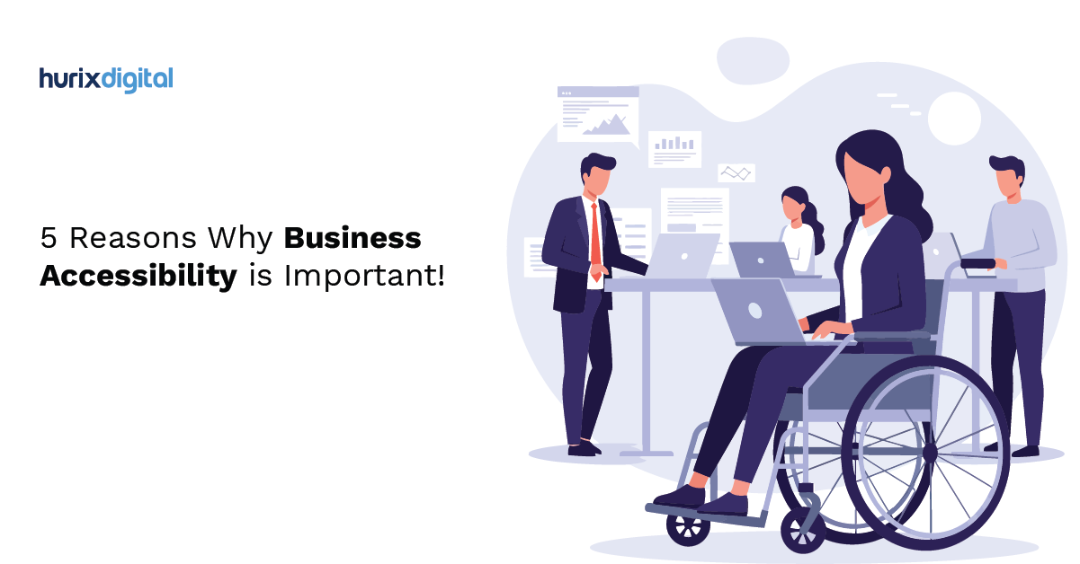
Also Read: 5 Reasons Why Business Accessibility is Important
3. Improve Navigation
Web accessibility is not only about using simple words or captioning images and videos. It should also be easy to navigate, meeting the needs of people with motor disabilities.
Here are some ways to make your digital content easy to navigate:
Break Texts into Sections
Packing too much content in a single paragraph can overwhelm any reader. Does this mean you need to limit the information in your content? Not necessarily.
Instead, break down your content logically and arrange them in easy-to-read blocks. It will enable readers to skim blocks they’re not interested in and navigate to sections they want to read.
Structure Your Content
Structure your content using headings and sub-headings. It will give readers a better context of what your content is about.
More importantly, it will enable readers using assistive technology to jump between sections and find the information they’re looking for.
PDF Remediation
If you have PDF documents online, you can increase their accessibility by PDF remediation. Labeling PDF documents to be read using assistive technology is the process of labeling them.
The most common PDF elements that need to be labeled or ‘tagged’ for easy readability are headings, images, links, tables, lists, and reading order.
4. Use Alt Text for Images
Images form an important part of many contents, but unfortunately, not everyone can access them. This is where alternative text or alt text comes in. They give a short, succinct description of the image displayed so visually impaired users can understand it.
Alt texts also appear when the images fail to load due to technical or internet issues.
Adding descriptive alt texts will enable visually impaired users to get the information on the image through screen readers. Without it, they may never know what the image contains.
Here are some tips to get maximum utility for alt texts:
- Add alt texts to all non-decorative images
- Keep it specific and succinct
- Use keywords on alt text for better SEO but do not stuff them
- Avoid starting with “Image of..” or “picture of..”
5. Provide Enough Contrast
Color contrast is an important consideration in web accessibility. It affects the way how people interact with the information on your website.
For the uninitiated, color contrast refers to the difference in light between the font and its background. It affects the readability of your content and is especially important for those with low vision or colorblindness. The content becomes much more apparent when you have your text in one color and the background in another hue.
For instance, white text is much easier to read on a black background than on a yellow one. But on the other hand, low color contrast can make your text very difficult and affect the user experience with your website.
The Web Content Accessibility Guidelines set by W3C recommends a minimum (level AA) contrast ratio between text and interactive elements to be 4.5:1. For large-scale texts, you can have a contrast of 3:1.
You can use online contrast checkers to calcite the contrast ratio and help you find the ideal color combination for your website.
Also Read: Accessibility for Masses – Know How Can Hurix Digital Comes in
Give Better Experience to Your Users
Web accessibility is vital in today’s digital world to ensure everyone gets equal access to knowledge and opportunities.
Hence, businesses, web developers, and content creators must all look to include elements that make their websites usable and enjoyable.
What’s more, accessibility solutions also improve your sales. You can read about six ways in which they help your business grow here.
At Hurix, we believe in providing equal access to digital content for people with differing abilities. As a result, we have helped leading global publishers meet accessibility standards. Our portfolio of accessible solutions includes Alt text creation, metadata tagging, video and audio transcripts, accessible documents & e-books, and accessible FL ePUB.
Get in touch to learn more about accessibility solutions from Hurix Digital.
Summarize with:

Vice President – Content Transformation at HurixDigital, based in Chennai. With nearly 20 years in digital content, he leads large-scale transformation and accessibility initiatives. A frequent presenter (e.g., London Book Fair 2025), Gokulnath drives AI-powered publishing solutions and inclusive content strategies for global clients