 A Space for Thoughtful

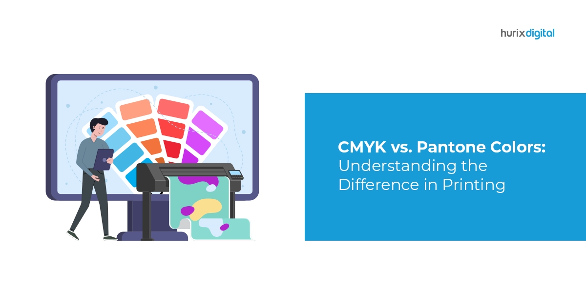
CMYK vs. Pantone Colors – Understanding the Difference in Printing
Summarize with:
When it comes to printing, color is a vital aspect that can significantly impact the outcome of any project. The selection of colors can make or break a design, and this is where the difference between CMYK and Pantone colors comes into play.
In this blog, we will delve into the distinctive attributes of each color system and explore why understanding the variance between them is crucial for creating visually appealing and accurate prints.
Table of Contents:
- What is the Difference Between RGB, CMYK, and Pantone?
- CMYK vs. Pantone vs. RGB
- What’s the Difference Between CMYK and Pantone Colors?
- Pantone Color to CMYK Conversion and Vice Versa
- Conclusion
What is the Difference Between RGB, CMYK, and Pantone?
Before we delve into the differences between CMYK and Pantone, it’s essential to briefly touch upon the RGB and CMYK color models.
1. RGB
The RGB color model stands for Red, Green, and Blue. It is used primarily for digital displays such as computer screens, television monitors, and mobile devices. In this model, colors are created by combining varying intensities of red, green, and blue light to form a wide spectrum of colors. However, RGB is not ideal for print, as printed materials use a different approach to represent colors.
2. CMYK
CMYK, on the other hand, stands for Cyan, Magenta, Yellow, and Key (Black). It is the standard color model used in printing. In CMYK, colors are created by combining percentages of these four ink colors. By overlapping these inks during the printing process, a full range of colors is produced. Unlike RGB, CMYK is more suitable for printing, as it simulates the actual ink mixing on paper.
3. Pantone
Pantone is a proprietary color-matching system widely used in the printing industry. It assigns specific numbers to each color, ensuring consistent and accurate reproduction across various materials and printing processes. Pantone colors are created by blending a set of base inks, and each color is identified by a unique code. This system is especially popular for corporate branding and logo designs, where color consistency is paramount.
Also Read: The 5-Step Prepress Checklist: Your Key to a Successful eBook Publication
CMYK vs. Pantone vs. RGB
When it comes to color selection in design and printing, the choice between CMYK, Pantone, and RGB is crucial. CMYK is commonly used in printing, while Pantone offers precise color matching for branding. On the other hand, RGB is ideal for digital displays. CMYK provides a wide range of colors but may lack accuracy, whereas Pantone ensures consistency but can be more expensive. Understanding the differences and knowing when to use each model will help you create stunning visuals across various mediums. Whether it’s a vibrant logo or a crisp print, the suitable color model elevates your designs to new heights.
What’s the Difference Between CMYK and Pantone Colors?
The primary difference between CMYK and Pantone colors lies in their color reproduction methods and usage scenarios:
1. Color Range
- CMYK: The CMYK color model offers a wide range of colors but is still limited in comparison to the Pantone system. The blending of the four process inks can produce most hues, but some vibrant and specific colors may be challenging to achieve accurately.
- Pantone: The Pantone system provides an extensive and standardized color library. Each Pantone color is meticulously mixed using specific ink formulations, resulting in more precise and consistent color reproduction. Pantone colors are beneficial for achieving spot colors that are difficult to reproduce in CMYK.
2. Color Consistency
- CMYK: Due to the nature of the CMYK color model, color consistency may vary between print runs and different printing devices. Factors like the type of paper, ink quality, and calibration can influence the final color output.
- Pantone: Pantone colors are explicitly defined by the Pantone Matching System (PMS), ensuring consistent color reproduction across different materials and printing processes. This level of color accuracy makes Pantone ideal for branding and corporate identity projects.
3. Printing Techniques
- CMYK: CMYK is the standard color model for most printing processes, including digital and offset printing. It is cost-effective and widely available, making it suitable for large print runs.
- Pantone: Pantone colors are commonly used in offset printing, where specific ink formulations can be precisely mixed to achieve the desired shades. While it can be more expensive than CMYK printing, it provides unmatched color accuracy.
4. Use Cases
- CMYK: CMYK is often used for full-color images, like photographs and complex designs. It is a practical choice for projects where color accuracy is not as critical and a wide color range is required.
- Pantone: Pantone colors are preferred when precise color matching is crucial, such as in logo design, branding materials, and any project where maintaining consistent colors across different media is essential.
Pantone Color to CMYK Conversion and Vice Versa
It is common for designers to work with both CMYK and Pantone colors depending on the project requirements and the intended printing method. Converting Pantone colors to CMYK and vice versa can be essential for maintaining color consistency and understanding how the colors will appear in different color spaces.
1. Pantone to CMYK Conversion
Converting Pantone colors to CMYK can be done using swatch books, software tools, or online converters. Keep in mind that Pantone colors with complex blends may not have a direct CMYK equivalent, and some color shifting might occur during the conversion process. It is always a good idea to perform a test print to ensure the desired results.
2. CMYK to Pantone Conversion
Converting CMYK colors to Pantone can be a bit more challenging, as not all CMYK colors have a direct Pantone match. In such cases, the closest Pantone color is chosen, and slight adjustments may be required to achieve a similar appearance.
Conclusion
In conclusion, understanding the difference between CMYK and Pantone colors is crucial for achieving the desired results in print projects. CMYK offers a broad color range and is suitable for most full-color printing needs. On the other hand, Pantone provides unmatched color consistency and is ideal for precise color matching, making it indispensable in branding and corporate identity applications.
Being familiar with both color systems and knowing when to use them significantly enhances the quality and impact of your print materials. So, whether you are working on a vibrant marketing brochure or a corporate logo design, considering the difference between CMYK and Pantone colors will undoubtedly elevate your print projects to the next level.
For expert guidance and assistance with your printing and design needs, contact Hurix Digital. Hurix Digital has a team of professionals who will help you achieve stunning and consistent print results using the right colors for your projects.
Summarize with:

Vice President – Content Transformation at HurixDigital, based in Chennai. With nearly 20 years in digital content, he leads large-scale transformation and accessibility initiatives. A frequent presenter (e.g., London Book Fair 2025), Gokulnath drives AI-powered publishing solutions and inclusive content strategies for global clients