 Upcoming Masterclass | Build an Army of Brand Evangelists using Training & Development | November 20th, 8:30 AM PDT | 11:30 AM EDT | 10:00 PM IST
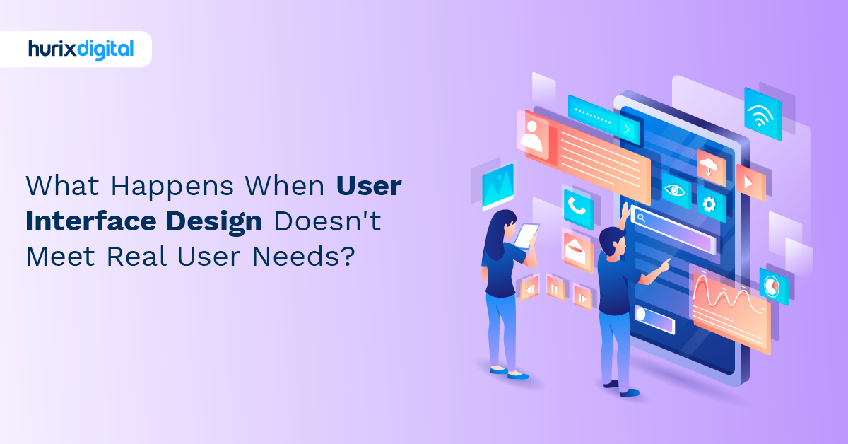
What Happens When User Interface Design Doesn’t Meet Real User Needs?
Two weeks ago, we watched a million-dollar product die right before our eyes. The CEO was doing a live demo for investors. Beautiful interface. Gradients that would make Jony Ive weep. Micro-animations that were smoother than butter. Then he tried to actually use it.
Click. Nothing. Click again. Loading spinner. Click the back button. The entire screen goes white. He’s sweating now. Tries to navigate to the dashboard. Gets lost in what the design team called “intuitive navigation.” Five minutes in, he gives up, switches to slides. The investors weren’t impressed. The design team had spent eight months crafting pixel-perfect mockups. And guess what? This design team also won three design awards before launch. Small problem: nobody could figure out how to use the damn thing.
This is user interface (UI) design in 2025. We’ve got more tools, frameworks, and methodologies than ever. Figma. Sketch. Design systems. Component libraries. AI assistants, such as Adobe Firefly, promise to design for you. Yet somehow, we’re still adding interfaces that make real-world users want to get rid of their devices. It has never been easier for designers to create perfect, controlled environments in contrast to the chaos of real life.
Here’s a dark secret that nobody admits at design conferences: Most user interface design fails not because designers lack talent, but because they’re solving the wrong problems. They’re optimizing for screenshots, not workflows. They’re designing for ideal users who don’t exist, not the messy humans who’ll actually touch their products. And worse, they’re chasing trends that’ll be dead before the product ships. Meanwhile, users just want to complete their tasks without requiring a PhD in interface archaeology.
Table of Contents:
- How Do We Balance Elegant UI Design With Technical Feasibility?
- Measuring UI Design ROI: What Key Metrics Truly Matter?
- How is AI Shaping the Future of User Interface Design Practices?
- How Do We Scale UI Design Systems Across Diverse Product Portfolios?
- How Do We Bridge the Gap Between User Research and Actionable UI Insights?
- Cultivating a High-Performance UI Design Team: What are the Best Strategies?
- How Do We Drive UI Innovation While Maintaining Brand Consistency?
- How Do We Address Ethical Considerations in Inclusive User Interface Design?
- How Do We Integrate Voice and Haptic UI Into Existing User Experiences?
- How Do We Prove UI Design’s Strategic Business Value to Stakeholders?
- Summing Up
How Do We Balance Elegant UI Design With Technical Feasibility?
Every designer has been there. You’ve created something gorgeous. The prototype sings. Then the engineering team looks at it and laughs. Not mean laughing. Sad laughing. The kind that says, “You have no idea how browsers work, do you?”
Last year, a designer showed us his new dashboard concept. Gorgeous 3D data visualizations. Real-time updates with particle effects. Smooth 60fps animations everywhere. When we enquired about performance. He said, “We’ll optimize later.” I asked about the mobile. “We’ll adapt it.” Load time? “The modern internet is fast.” They shipped it. Average load time: 27 seconds. On desktop. With fiber internet. Mobile users? They gave up before it loaded.
The problem starts with tools. Design tools let you do anything. Literally anything. That 200-layer composition with blend modes and masks? Figma handles it fine. Browsers? Not so much. Those gorgeous custom fonts? They’ll add 2MB to your load time. That parallax scrolling background video? Hope your users enjoy fan noise. Modern user interface design tools have removed all constraints, which sounds great until you realize that constraints forced creativity.
Measuring UI Design ROI: What Key Metrics Truly Matter?
“Design is subjective” is what designers say when they don’t want to measure anything. CFOs hate this answer. They hate it with the fire of a thousand suns.
Traditional metrics miss the point entirely. Time on site? Maybe users are confused, not engaged. Page views? It could mean they’re lost. Even conversion rates lie. We have seen beautiful redesigns, tank conversion initially, then triple it after users adjusted. Which number do you report? The executives breathing down your neck don’t want to hear “It’s complicated.”
Task completion rate tells real stories. Can users do what they came to do? Sounds obvious. It’s not. A major bank redesigned its transfer flow. Gorgeous. Award-winning. Task completion dropped 34%. Users couldn’t find the submit button. It was there, just designed so minimally that it looked like decorative text. They made it ugly—blue, underlined, obviously clickable. Task completion hit 80%. Sometimes ugly works.
Customer lifetime value (CLV) changes tell the long-term story. We redesigned one subscription service’s UI. To be honest, initially, it hurt signups, which led to panic at the managerial level. But users who did sign up stayed longer—much longer. CLV increased 40% over six months. The interface filtered out users who would have churned anyway. It’s better to lose them at signup than after consuming support resources.
How is AI Shaping the Future of User Interface Design Practices?
Everyone’s talking about AI designing entire interfaces. “Just describe what you want!” Sure. We had a team try this. “Design a dashboard for project management.” The AI created something that looked like Jira had a baby with Excel, and that baby was raised by wolves. Technically, it had all the elements. Practically? Unusable. The AI had no context for actual workflows, team dynamics, or why anyone would want a 27-column kanban board.
Where AI actually helps: the boring stuff designers hate. Generating icon variations. Creating color palettes that pass accessibility standards. Writing microcopy in 17 languages. Resizing designs for 900 different screen dimensions. One designer told us that AI saved her 20 hours weekly on production work. She spends that time actually thinking about user problems. Revolutionary concept.
Pattern recognition is AI’s superpower. Feed it your analytics, and it spots user behavior patterns humans miss. A travel site’s AI noticed users always checked prices in a specific order: flights, hotels, cars. Always. They took our services and we recommended having navigation backward. They did that. Conversions increased 23%. Humans had stared at that data for years without seeing it.
But here’s a caution. AI-generated interfaces all look the same. Because they’re trained on existing designs. Which were trained on earlier designs. We’re heading toward a design singularity where everything looks like everything else. Medium, Notion, Linear—can you tell them apart anymore? AI amplifies this convergence.
How Do We Scale UI Design Systems Across Diverse Product Portfolios?
Design systems are like diets. Everyone starts one. Few maintain them. Most abandon them for the design equivalent of pizza at 2 AM.
The promise sounds perfect: consistent components across all products. Build once, use everywhere. Reality? Your banking app needs different patterns than your retail site. Your enterprise dashboard can’t use the same components as your consumer mobile app. One client we were talking to tried forcing a single design system across twelve products. Everything ended up looking like their most boring enterprise tool. Consumer products died. They’re still recovering.
Governance is where design systems go to die. Who decides if a new component gets added? Who maintains documentation? We have seen design systems with three different button components because nobody wanted to compromise. We helped one client solve this with a design system tribunal. Yes, tribunal. Three people with absolute veto power over new components. Sounds fascist. Worked brilliantly.
Version control becomes existential. Team A needs an urgent fix to the date picker. Team B is mid-project and can’t handle changes. That Team C wants a complete redesign. One client maintains four versions of their design system simultaneously. Four! Their designers spend more time managing versions than designing. They tried strict versioning with quarterly releases. Teams just forked the system and diverged anyway.
Technical implementation varies wildly across platforms. Your React components don’t work in Angular. Your web patterns break on native mobile. That beautiful iOS interaction is impossible on Android. Smart companies build platform-specific versions with shared principles. Dumb ones try to force exact parity and wonder why everything feels wrong everywhere.
How Do We Bridge the Gap Between User Research and Actionable UI Insights?
User research reports are often where insights are forgotten. 200-page PDFs that nobody reads. Executive summaries that summarize nothing. Meanwhile, designers are making stuff up because they can’t find the relevant research.
The translation problem is real. Researchers speak in personas and journey maps. Designers need to know if the button should be blue or green. The gap between “users value efficiency” and “put the save button here” is massive. One client, before coming to us, tried bridging this by having researchers embed with design teams. Didn’t work. Researchers felt like they were becoming designers. Designers felt like they were being watched. Everyone was miserable.
Specificity matters more than comprehensiveness. “Users find the checkout process confusing” helps nobody. “Users can’t find the promo code field because it’s below the fold on mobile” is actionable. After consulting us, one research team started delivering findings as specific UI recommendations. Not wireframes, but clear statements like “Move the search bar to the top-left, make it 40% wider, add autocomplete.” Designers initially resisted this “overreach.” Then they realized how much faster they could work.
Research democratization sounds good, but it needs boundaries. “Everyone should talk to users!” Sure, but not everyone should interpret what they hear. We have seen engineers completely redesign features based on one user complaint. Sales teams are demanding changes because one prospect mentioned something. Design by anecdote is worse than no research. Smart teams have research protocols: who can conduct research, how findings are validated, and when they influence decisions.
Cultivating a High-Performance UI Design Team: What are the Best Strategies?
Hiring for potential over portfolio changes everything. Everyone wants the designer with Apple on their resume. But that designer might have spent five years making icons slightly rounder. Meanwhile, the unknown designer from a failed startup had to design entire products, talk to users, fight for resources, and ship with constraints. Guess who’s more valuable? A fintech company started hiring designers with no fintech experience deliberately. Fresh eyes saw problems industry veterans had accepted. Their interfaces became radically simpler.
Psychological safety determines creative output. Designers need to show bad ideas to find good ones. If showing a bad idea gets you mocked or fired, you’ll only show safe ideas. Safe ideas are boring ideas. One of our clients followed “Terrible Tuesday”—weekly sessions where designers must present their worst ideas. Deliberately bad. Sometimes, terrible ideas spark brilliant ones. More often, they just laugh. But the laughter makes the real critiques less scary.
Specialization versus generalization tears teams apart. Should designers code? Should they write copy? Do research? Motion design? One startup we were in talks with required all designers to be “full-stack.” Sounds efficient. In practice? Everything was mediocre. Nobody excelled at anything. They pivoted to specialists working in pods. Visual designer, interaction designer, researcher, writer. Overhead increased. Quality exploded. Clients noticed immediately.
Tools standardization seems minor, but it isn’t. When half the team uses Figma, half uses Sketch, and someone insists on Adobe XD, collaboration dies. Files don’t transfer. Feedback fragments. Version control becomes impossible. One team spent three months fighting about tools. Finally, leadership mandated Figma. Everyone complained. Six months later, nobody could imagine working differently. Sometimes dictatorships work.
How Do We Drive UI Innovation While Maintaining Brand Consistency?
Brand consistency is where innovation goes to die. “It needs to feel like us.” Translation: “Make it look like everything else we’ve done.” Brand guidelines become prisons. That 47-page document specifying exact blue hex codes, border radii, and shadow depths? It was relevant when written. Five years later, it’s forcing designers to create interfaces that look dated before they launch.
Innovation happens at the edges. The main product stays consistent. Experimental features push boundaries. If they work, they influence the core. If they fail, they disappear quietly. Google does this constantly. Remember Google Wave? Huge failure. But real-time collaboration from Wave is now in everything. The innovation survived even though the product died.
Brand voice matters more than visual consistency. It affects how errors are communicated, how features are explained, and how empty states encourage action. Mailchimp’s interface has changed dramatically over the years. However, the voice remains friendly, helpful, and slightly quirky. Users feel continuity even though everything looks different. Meanwhile, companies with consistent visuals but inconsistent voice feel schizophrenic.
How Do We Address Ethical Considerations in Inclusive User Interface Design?
Inclusive design is where good intentions meet uncomfortable realities. Everyone wants to be inclusive. Few want to do the work. Dark patterns are everywhere because they work. That confusing cancellation flow? Intentional. The pre-checked boxes? Deliberate. The hidden unsubscribe link? Designed that way. One designer told us that they were explicitly asked to make cancellation “difficult but not impossible.” Legal but unethical. They quit. Their replacement made it even worse. Ethics without enforcement is just philosophy.
Accessibility as an afterthought creates technical debt and human harm. “We’ll add accessibility later” means never. Or after the lawsuit. A gaming company launched without keyboard navigation. “Gamers use controllers.” Except for disabled gamers who use specialized keyboards. Class action lawsuit. Millions of dollars went into the settlement.
Algorithmic bias hides in user interface design. The AI that suggests profile picture crops out Black faces. The form requires a “traditional” name format. The financial app that shows different interfaces based on zip code. These aren’t bugs. They’re biased design decisions automated at scale. We helped one client discover that its onboarding flow had 50% lower completion for Spanish names. The regex validation was wrong. For two years. Nobody noticed because the designers all had “normal” names.
How Do We Integrate Voice and Haptic UI Into Existing User Experiences?
Voice UI is where science fiction meets disappointing reality. “Computer, enhance!” doesn’t work when the computer keeps hearing “Computer, and pants!”
Voice interface design fails because designers think it’s about commands. It’s not. It’s about conversation. Humans don’t speak in commands. They ramble, restart, and change their minds mid-sentence. “Set a timer for… wait, no, actually make that an alarm for… um… 7:30.” Good luck parsing that. Most voice interfaces give up. Users give up faster.
Context switching between voice and visual is jarring. You’re tapping, then talking, then tapping again. The mental model breaks. One smart home app tried to be “voice-first.” Users couldn’t figure out what to say. They added visual hints. Users just tapped the hints instead of speaking. They gave up and made it touch-first with voice shortcuts. Usage exploded. Lesson: Voice augments, doesn’t replace.
Haptic feedback is the design element nobody thinks about until it’s wrong. That little tap when you press a button. The buzz for notifications. The rumble for errors. Get it wrong, and users think their device is broken. One app had such aggressive haptics that users thought their phones were malfunctioning. Support tickets poured in. “My phone is buzzing randomly!” It wasn’t random. It was responding to every interaction. They dialed it back 90%. Subtle works.
Privacy concerns kill voice adoption. “Is it always listening?” Yes. “Does it record everything?” Depends. “Can employees hear my commands?” Sometimes. Users don’t trust voice interfaces, and honestly, they shouldn’t. Every major voice platform has had privacy scandals. Employees listening to recordings. Data breaches. Accidental activations record private conversations. User interface design can’t fix trust issues, but it can be transparent about what’s happening.
How Do We Prove UI Design’s Strategic Business Value to Stakeholders?
Before-and-after metrics tell stories that executives understand. Not wireframes and user flows. Numbers. Revenue. Costs. Efficiency. We helped one B2B platform’s redesign, and that reduced training time from two weeks to three days, saving them a few thousand dollars per new employee.
Design debt accumulates like technical debt but is hidden deeper. Each quick fix, each “temporary” solution, and each skipped user test adds to it. Eventually, the entire system becomes unmaintainable. One enterprise client’s product became so complex that new features took months to figure out where to go. They had to freeze feature development for a year to restructure the interface—a year! The CEO was furious until shown that continuing would mean two years to ship anything new.
Strategic design decisions ripple through organizations. That simpler interface? Fewer support tickets. Cleaner design system? Faster feature development. Better onboarding? Higher lifetime value. One client tracked every metric affected by their redesign. The total impact was 5x what they predicted. Most benefits were indirect. Support cost reduction. Development efficiency. Employee satisfaction. Design touches everything. When executives see that map, they get it. Finally.
Summing Up
After nearly two decades in the trenches of user interface design, here’s what we learned: The best interfaces are invisible. Users don’t praise them, and they don’t even notice them. They just complete their tasks and move on. That’s success. But try explaining that to stakeholders who want something that “pops,” “delights,” and “creates joy.” Joy is finishing your task quickly and moving on with your life.
The success of companies with superior user interface design stems not from better designers but from superior processes. These processes involve testing with real users, measuring what truly matters, and evolving systematically. At their core, these organizations recognize that design transcends mere decoration, serving instead as the visible manifestation of decision-making.
For Hurix Digital and our clients, navigating the complex world of UI/UX, the path forward isn’t about following trends or copying competitors. It’s about understanding your users’ actual needs, respecting technical constraints, measuring real outcomes, and having the courage to be boring when boring works.
Partner with us to elevate your digital presence and confidently shape the future of your user experience journey.

Associate Vice President – User Experience Design at Hurix Digital (EMEA), with 10+ years in UX and design leadership. She champions AI‑driven, inclusive, and strategy‑led UX across banking, fintech, EdTech, MedTech, and e‑commerce sectors.