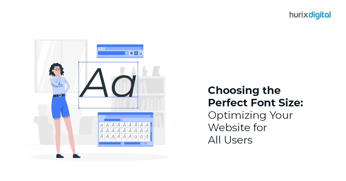
Choosing the Perfect Font Size: Optimizing Your Website for All Users
Every website owner aspires to have a dream website that is perfectly optimized and responsive for the audience. The font that you use for your content plays a significant role in increasing your website’s readability, accessibility, and aesthetics. Font size optimization improves your SEO rankings, conversion, and mobile friendliness and is critical for augmenting user experience.
Employing user-friendly font sizes is an extremely crucial part of providing an enhanced user experience. Many times, website owners use fonts that are very difficult to read on different screens. This leads to visitors simply leaving prematurely without going through the entire site. Optimizing your fonts makes the content legible, understandable, and interesting.
Table of Contents:
- Impact of Web Typography on SEO
- Factors to Consider While Creating Responsive Typography
- The Final Word
Impact of Web Typography on SEO
Web typography is the process in which different types of fonts are used while designing a website. It is key to improving SEO ranking, readability, and web accessibility.
The right font does impact your website’s ranking on search engines and makes the reading effortless. It can improve your conversion as well as user experience in a way you cannot imagine.
A well-crafted web typography boosts visual hierarchy and smoothly guides the users through the interface, reinforcing the brand identity.
Factors to Consider While Creating Responsive Typography
Content that is created using typography best practices helps optimize the user interface and enhances user engagement. Here are some factors that you need to keep in mind while designing your web typography.
1. Use Minimum Number of Fonts
Using too many types of fonts or font sizes may make your website look unprofessional and unstructured. Stick to one or a maximum of two font families throughout the website to avoid confusing your visitors.
Also, make sure that you are pairing the right ones together to make your content look appealing. Utilize this right pairing of web typography to create hierarchy and visual harmony. Use one font for the headlines and the complementary font for the text.
2. Use Standard or Web Safe Fonts
Try using a standard or system font to avoid distracting users from your website content. Flowery or curved fonts sidetrack the visitor from reading the text attentively.
Unless you want some custom fonts for branding or your website content requires such artistic web typography, adhere to system fonts. It ensures the readability of the text; hence, every visitor will be able to comprehend it.
3. Character Limitations
Ensure that your text is spread evenly throughout the website. Too congested or too spread out text tends to reduce user engagement.
Limiting characters on each line will enhance readability and web accessibility for the users. Using 60 characters per line ensures a good reading experience for desktops, while 30-40 characters per line work well for smartphones.
Also Read: How to Design Eye-Catching Book Covers for Print Publishing in 2024!
4. Select Versatile Fonts
Choose font styles that work in multiple sizes and weights. This guarantees readability for every screen size and resolution. Some styles are not mobile-friendly fonts. Though interesting and visually appealing, these become difficult to read on smaller screens.
5. Add Attributes
Attributes such as making the text bold, italic, capitals, or color help you make your text conspicuous and attract visitors to the website. However, balance is crucial as using too many attributes for the web typography will make it look cluttered.
Especially, avoid using all capitals except when you are using acronyms or logos. Use capital letters for the first letter of the headlines.
6. Apply Modular Scales and Appropriate Font Size
Font size optimization plays a key role in improving the understandability and aesthetics of web content. Ensure legibility and web accessibility using appropriate font sizes.
Maintain proper proportion of various text elements of your website using modular scale. A modular scale is a series of font sizes based on a predetermined ratio that ensures a harmonious relationship of the text typographic elements.
7. Take Care of Spacing
Maintain proper spacing between the lines to enhance the readability of your content and viewer engagement. Increasing line height or spacing to about 30% more than the character height adds to legibility and helps understand the content better.
8. Alignment
Follow a similar pattern of alignment of web typography throughout the website. It provides a uniform and organized look to your content. Proper alignment of images, charts, texts, and other components is visually appealing to the visitors. It improves comprehension and user engagement.
9. Correct Color Contrast
The most visually appealing component of any website is a color feature. Used appropriately, it can attract users to your website and help build brand recall.
The most basic and widely used color combination is the black text written on a white background. Nonetheless, you can custom design using any light and dark color combination as long as it looks interesting and enhances web accessibility.
Despite that, avoid using text in red or green color as green and red color blindness is the most common type of color blindness. Color blindness being common, use other colors or cues to highlight important parts of the content and augment web accessibility of your site.
10. Support Assistive Technology
Employing responsive typography that facilitates the use of screen readers or other assistive devices is ideal for users suffering from cognitive disabilities or visual impairments.
Usually, such users find it difficult to access the content due to their deficiencies. Designing your website keeping their needs in mind will improve web accessibility and impact user experience.
11. Relevancy of Font
Design user-friendly fonts with an eye on your brand identity. Different fonts represent different perceptions.
Sans-serif fonts offer a clean and modern appearance while Serif type of fonts project authority and tradition. Create responsive web design in alignment with the tone of your brand to enhance viewership and user experience.
12. Device Compatibility
A laptop and a smartphone have entirely different screens. Appropriate font size optimization makes the text readable from different types of devices. Create fluid web typography using viewport units, which can easily gel with different screens.
Furthermore, if you are setting your content for mobile users, view it from mobile to understand if it is perfectly suitable for a smartphone screen.
Also Read: Cultural Influences on Typography: Global Perspectives in Typesetting
The Final Word
Using appropriate font size, typefaces, spacing, and other web topography components, designers can develop a visually appealing website that successfully engages the audience.
It helps in communicating the intended message effortlessly and enhances readability. It develops the user’s trust in the brand and helps shape the brand impression. And the best way to navigate this? Hurix Digital!
Hurix Digital is here to help you learn more about typography best practices and create digital experiences that promote web accessibility and user engagement retention.

Vice President – Digital Content Transformation. He is PMP, CSM, and CPACC certified and has 20+ years of experience in Project Management, Delivery Management, and managing the Offshore Development Centre (ODC).


